What’s Actually Inside a Full Brand Guidelines Document?
Not All Brand Guidelines Are Created Equal—Here’s What I Include in a Complete Brand System
If you’ve ever received a one-page logo sheet and thought “this is fine, right?”—this might not suit all projects. When it comes to branding, especially for growing businesses, strong brand guidelines are what transform a visual identity into a usable, lasting, cohesive system.
As a designer, I tailor brand guidelines based on the size and complexity of the project. But for larger branding jobs, I go deep—so future designers, team members, and content creators can all apply the brand consistently and with confidence.
Here’s a look at what’s included in a comprehensive brand guidelines document.

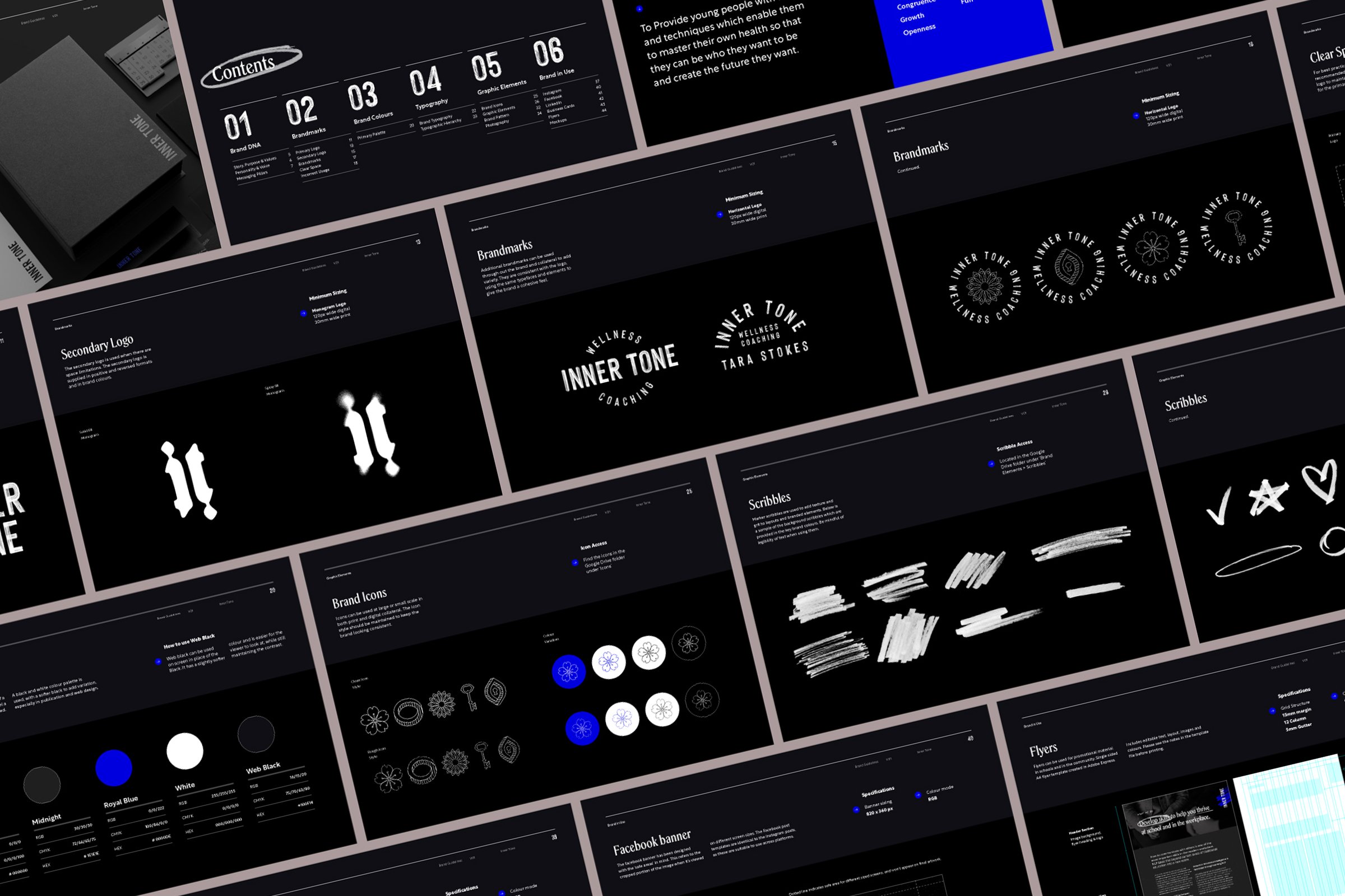
This brand used my Bold Brand Guidelines templates that you can find in my Design Shop.
What I Include in a Comprehensive Brand Guidelines Document
1. Welcome + What to Expect
The document begins with a warm welcome and an outline of what’s inside. This intro page or section sets expectations for how to use the guide, who it’s for (think: marketing teams, future designers, printers), and why consistency matters. It’s not just a “how-to”—it’s a reference tool designed to grow with the brand.
2. Brand DNA
This is the strategic heart of the brand. It helps clarify the purpose behind the visuals and ensures that every creative decision is rooted in meaning.
What’s included:
Brand Story: A short narrative that captures the brand’s origin, purpose, and goals.
Vision & Mission: What the brand aims to achieve and how it contributes to its industry or community.
Core Keywords: A list of words that define the brand’s personality and positioning.
Tone of Voice: Guidelines for how the brand sounds across communication channels.
Messaging Pillars: The 3–5 core messages the brand wants to consistently communicate. These are useful for anyone writing content, social posts, or ads.
3. Brand Marks
This section shows how the brand shows up visually through its logos and symbols. Each element is explained so there's no confusion about what to use, when, and how.
What’s included:
Primary Logo: The main version of the logo and when to use it.
Secondary Logo / Alternate Layouts: Variations (like stacked, horizontal, or icon-only).
Monochrome and Colour Versions: Guidance on using logos on light, dark, and coloured backgrounds.
Favicon or Icon Mark: Standalone marks used for social media, websites, or app icons.
4. Logo Usage Guidelines
This ensures the logo maintains its integrity across platforms and design contexts.
What’s included:
Clear Space: Minimum spacing around the logo to avoid crowding.
Minimum Size: Guidelines to ensure legibility in print and digital formats.
Incorrect Usage Examples: What not to do (stretching, rotating, colour changes, placing on busy backgrounds, etc.).
Alignment Tips: How to align logos in layouts or with typography.
5. Colour Palette
A flexible and detailed colour system ensures the brand looks consistent across all touchpoints—from websites to print to packaging.
What’s included:
Primary & Secondary Colours: Organised by usage priority.
HEX, RGB, CMYK & Pantone Codes: Provided for both digital and print use.
Colour Ratios or Use Cases: For example, which colours should dominate vs. accent.
Accessibility Tips: Optional contrast checks or notes for legibility.
6. Typography System
Typography plays a huge role in a brand’s tone and professionalism. This section outlines how to use type effectively and consistently.
What’s included:
Primary Typeface: For headlines and key brand messages.
Supporting Typeface(s): For body copy, captions, or technical content.
Hierarchy Examples: A clear breakdown of heading levels, paragraph styles, and spacing.
Web Safe Alternatives: Suggestions if licensed fonts aren’t available.
7. Graphic Elements
These are the building blocks that bring personality to the brand and help connect all touchpoints visually.
What’s included:
Custom Illustrations, Icons, or Patterns: Shown with examples and usage rules.
Linework, Shapes, or Motifs: Explained in terms of scale, layering, and context.
Texture or Brush Styles: If used, how to apply them for consistency.
Do’s and Don’ts: Helps other designers use these elements without going off-brand.
8. Photography & Imagery
Imagery is a powerful brand signal. This section shows how to maintain a consistent visual style even when photography is outsourced or DIY.
What’s included:
Photography Style Guide: Examples of lighting, mood, cropping, and subject matter.
Image Categories: Portraits, product shots, lifestyle, environment, etc.
Editing Preferences: Filters, grain, contrast levels, colour warmth.
Inspo Moodboards (Optional): For clients who want to replicate the style in future shoots.
9. Brand in Use
This is where the guidelines come to life—through real-world applications that demonstrate how the brand looks across platforms.
What’s included:
Social Media Posts: Instagram, Facebook, LinkedIn, etc.
Print Collateral: Business cards, flyers, menus, signage.
Packaging Concepts or Website Mockups: To show branding applied holistically.
Style in Context: How the typography, colours, and graphic elements work together.
10. Extra Touches
It’s always nice to leave a lasting impression. This section adds value and reinforces a thoughtful client experience.
What’s included:
Desktop or Phone Wallpapers: On-brand graphics clients can use and share.
Thank You Note: A short, personalised message to end the project on a high.
Quick Reference Sheet (Optional): A 1-page summary of key brand elements for easy access.

Professional, Playful, and Packed with Real-World Value
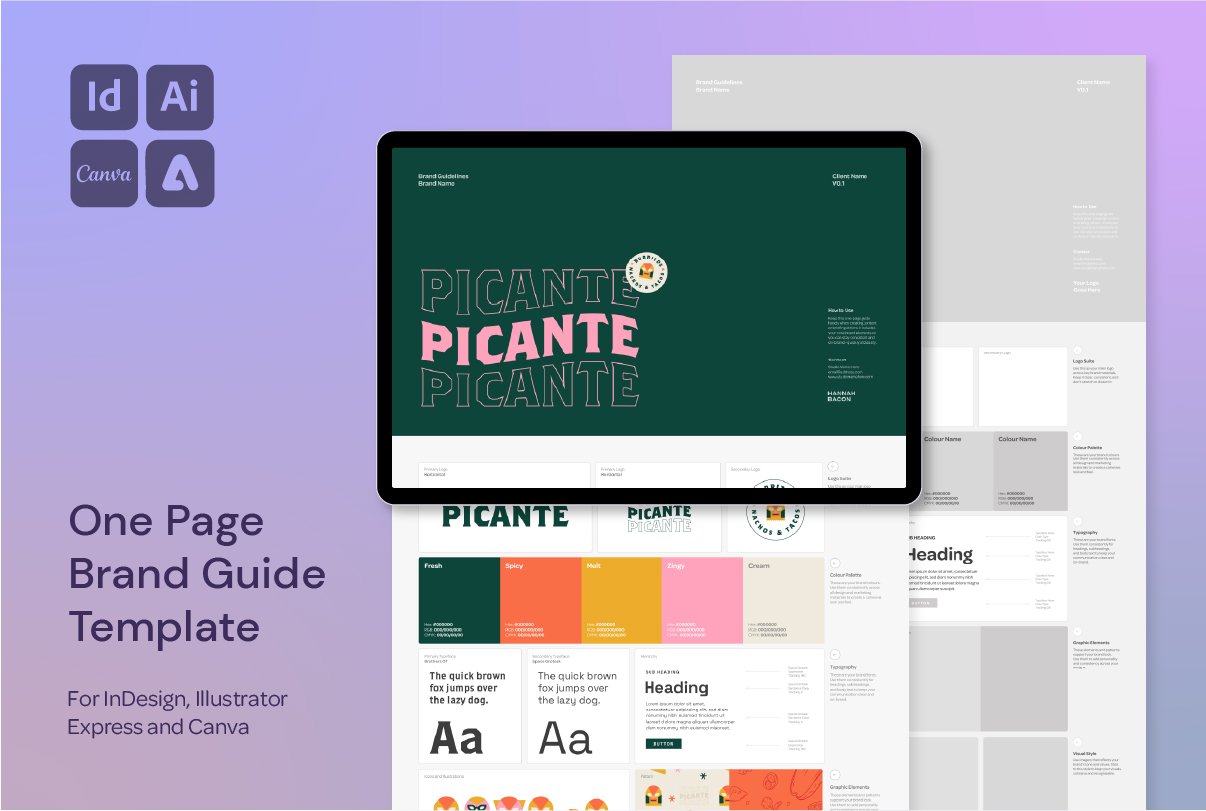
Deliver polished, on-brand guidelines your clients will love — without reinventing the wheel. This Brand Guidelines Template helps you present your branding work clearly, consistently, and confidently.
With a bold but approachable design and versatile layout, this template is perfect for freelancers and studios alike. Whether you're designing in Adobe InDesign, Illustrator, Canva, or Adobe Express, you'll have everything you need to provide a seamless brand handoff that educates and empowers your clients.
What’s Included
✔ Fully editable files for InDesign (.INDD + .IDML), Illustrator (.AI), Canva, and Adobe Express
✔ Clean, creative design that works with any brand style
✔ Real, ready-to-use content from a working brand designer
✔ Comprehensive sections covering logos, colours, typography, graphic elements, brand use across digital + print, and more
✔ Flexible layout so you can customise or remove sections based on project scope
Built for Real Projects
This isn’t just a pretty layout — it’s been tested and refined through real client work. The content inside reflects the actual brand strategy and design handover process I use in my studio, designed to:
• Help your clients understand and use their new brand identity
• Add value to your branding packages
• Create consistency across platforms (social, print, web)
• Build trust and authority in your design process
One Template, All the Flexibility
Whether you’re handing off a full visual identity or a smaller logo package, this guide can grow and shrink to suit the scope. Use it as a one-page brand sheet or a detailed brand book — it’s up to you.
Compatible With:
Adobe InDesign (.INDD + .IDML)
Adobe Illustrator (.AI)
Canva (Free or Pro)
Adobe Express (Free or Premium)
Want More Time-Saving Tools and Freebies?

This process is just one of the techniques I share across my design templates and digital assets, made especially for designers who want professional results—without starting from scratch every time.